The Basics Of Reading Stock Market Charts
Understanding stock market charts is a crucial skill for anyone involved in investing or trading. These charts provide valuable insights into how a particular stock, index, or other financial instrument has performed over time. By learning how to read these charts, you can identify patterns, trends, and key signals that help inform your investment decisions. In this article, we'll go over the fundamentals of reading stock market charts, breaking them down step-by-step to make them easier to understand.
What Are Stock Market Charts?
Stock market charts visually depict the price movements of financial instruments like stocks or indices over a specified period. They illustrate key data points such as opening, closing, highest, and lowest prices within a selected timeframe. These charts enable traders and investors to analyze past performance and make informed predictions about future price trends.
Stock charts come in various types, but the most common are line charts, bar charts, and candlestick charts. Each type provides a different view of the same underlying data but is useful in different contexts.
Types Of Stock Market Charts
There are three main types of charts used to track price movements in the stock market: line charts, bar charts, and candlestick charts. Each chart has its unique features, and understanding these differences can help you decide which one to use.
Line Charts
A line chart is the simplest type of stock chart. It consists of a single line that connects the closing prices of the stock over a given period. This type of chart is useful for showing the overall trend of the stock over time but lacks detail about intraday price movements. Line charts are great for long-term trend analysis but not ideal for understanding the volatility or the highs and lows of a stock.
Bar Charts
Bar charts provide a more detailed view of stock price movements. Each bar represents a specific period (such as a day, week, or month) and includes the opening, closing, highest, and lowest prices within that period. The vertical line of the bar indicates the price range, while small horizontal lines on the sides show the opening (left) and closing (right) prices. These charts are popular among traders seeking a deeper understanding of price fluctuations.
Candlestick Charts
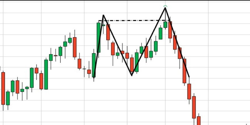
Candlestick charts are similar to bar charts but with more visual appeal. Each "candlestick" represents a specific period, and it shows the open, closed, high, and low prices. The body of the candlestick is the area between the opening and closing prices. If the stock closed higher than it opened, the candlestick is typically coloured green or white.
If the stock closed lower than it opened, the candlestick is usually coloured red or black. Candlestick charts are very popular because they provide a lot of information in a visually easy-to-understand format. They are especially useful for traders because they can help identify patterns that signal potential price movements.
Key Elements Of A Stock Market Chart
When you look at a stock market chart, there are several key elements that you need to pay attention to in order to interpret the information effectively. Understanding these elements will help you make sense of the data and gain insights into how the stock is performing.
Price Axis (Y-Axis)
The vertical axis of the chart represents the price of the stock. It shows the range of prices the stock has traded at over the selected period. As you move upward on the price axis, the price increases, and as you move downward, the price decreases.
Time Axis (X-Axis)
The horizontal axis of the chart represents time. This could be days, weeks, months, or even years, depending on the time frame you've chosen. The time axis helps you track the stock's price movements over time and identify trends.
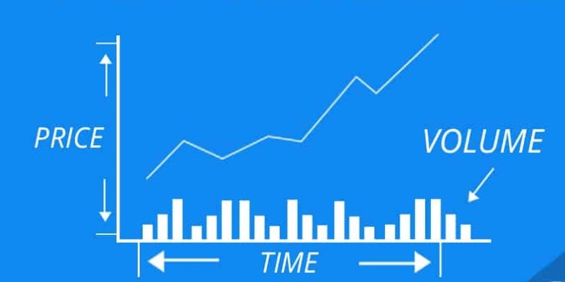
Volume Bars
Volume bars are typically located at the bottom of a stock chart and represent the number of shares traded during a specific period. High trading volume can indicate strong investor interest and may signal a significant price movement.
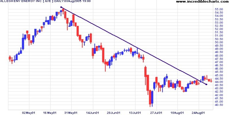
Trend Lines
Trend lines are drawn on charts to represent the general direction in which a stock is moving. An upward trend line indicates that the stock price is rising, while a downward trend line shows that the stock price is falling. Trend lines can help identify support and resistance levels and are a useful tool for technical analysis.
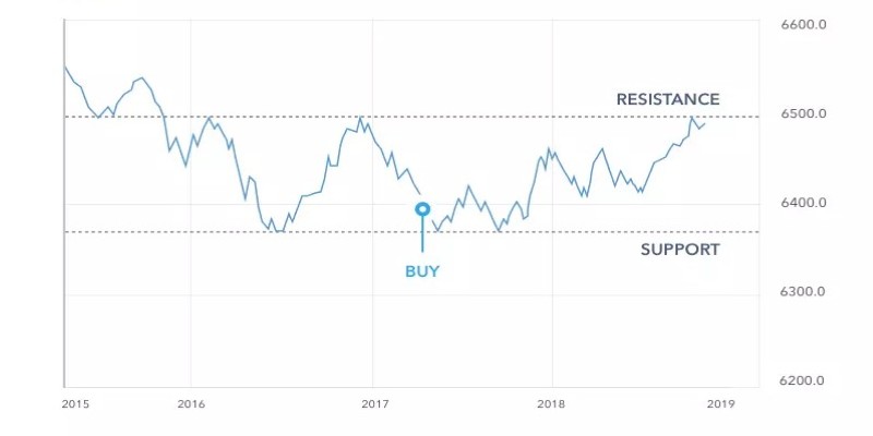
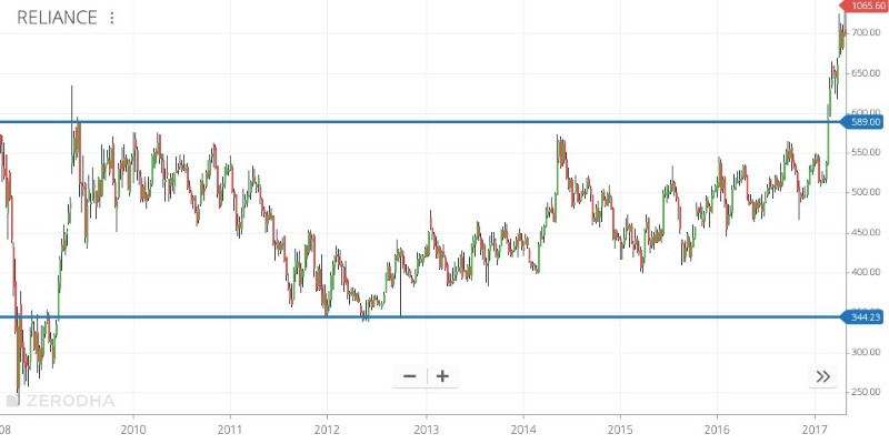
Support And Resistance Levels
Support levels are the prices at which a stock tends to stop falling and may bounce back up. Resistance levels, on the other hand, are the prices at which a stock tends to stop rising and may start to fall again. These levels are important because they indicate where the stock might change direction.
Interpreting Stock Market Trends
The key to reading stock market charts lies in identifying trends. Trends represent the general direction in which a stock’s price is moving. There are three types of trends:
Uptrend (Bullish Trend)
An uptrend occurs when the stock price is consistently making higher highs and higher lows. This suggests that the stock is in a bullish (rising) trend, and investors expect the price to continue going up.
Downtrend (Bearish Trend)
A downtrend happens when the stock price is consistently making lower highs and lower lows. This indicates that the stock is in a bearish (falling) trend, and investors expect the price to continue dropping.
Sideways Trend (Neutral Trend)
A sideways trend occurs when the stock price moves within a narrow range with no clear upward or downward movement. This type of trend often occurs when the market is uncertain and investors are waiting for a catalyst to drive the price in one direction.
Identifying trends is a crucial skill for anyone reading stock charts. By recognizing the direction in which a stock is moving, you can make more informed decisions about when to buy, sell, or hold.
Conclusion
Reading stock market charts is an essential skill for investors and traders. By learning how to interpret the various types of charts, understand key elements like support and resistance levels, and identify trends, you can gain valuable insights into the performance of stocks. Whether you are a beginner or an experienced investor, mastering the basics of stock charts will help you make more informed decisions in the stock market.